Uplifting Brands That Uplift Others

hello@upandup.agency
504 Rhett Street, Suite 100
Greenville, SC 29601
(864) 373-9330


hello@upandup.agency
504 Rhett Street, Suite 100
Greenville, SC 29601
(864) 373-9330


 digital marketing | higher ed landing pages | higher education | higher education website design | web development
Behind every successful advertising campaign is a landing page that is designed with one thing in mind: a conversion. And like most things marketing related, there’s an art and a science to designing a higher ed landing page.
We’ve dissected our most successful landing pages and found six principles to help you design the perfect landing page for your program or department.
Like marketing campaigns and advertising messages, landing pages should be designed with one focus or goal. As you’re planning the page, be precise when defining the one goal you want users to complete once they hit your page. Remember, your marketing efforts are already competing with more than 7,000 competing marketing messages. The more potential actions we give a visitor to our page, the more distraction we create on top of an already distracting web experience.
Understanding information hierarchy and user flow can turn a good landing page into a much more effective landing page. The goal is to develop a landing page experience that is appealing and aligns with our natural flow of reading online.
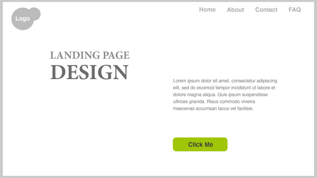
First, start with the structure of the page. What are the most important messages, actions and visuals components you need to meet your goals? Once you’ve listed them, order them in a way that makes sense with your campaign goals. Below, we’ve mapped out sample landing page components that highlight a typical hierarchy of information.
When it comes to headlines and subheadlines, there’s a typical pattern to how users will read each layer of copy. Consider each line and build a narrative that aligns your ad to landing page. In our first illustration, we’ve sketched out how this would look.

Next, consider the two primary reader flows: The “Z” and the “F” patterns. If your page needs to be copy heavy, the “F” flow provides a natural experience. Most often, visitors will start at the top left of the page, scan right and then down the left side of the page until a component stops their scan.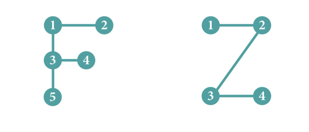
The “Z” pattern considers how readers engage with a page with more visual elements and less copy. Creating components that alternative styles creates a more pleasant user experience.
While campaign landing pages are often developed on the periphery of brand work or outside of your website, it shouldn’t be a completely different experience for the user. Successful landing pages account for the entire campaign ecosystem as well as the entirety of the customer journey.
To be clear, campaign landing pages should be consistent with your paid media and your owned assets–your website. We’ve covered the importance of aligning your advertising with your landing page–the same can be said for your website.
Why? Our brains were designed for pattern recognition and we process visuals (i.e. design) much faster than messages. Message alignment is important, but visual consistency instills a sense of confidence and relevancy-removing user dissonance.
Read: Leading the Elephant: 5 Strategies for More Impactful Campaigns
When designing your higher ed landing pages, pull in brand guidelines as well as ad design elements. You don’t need to incorporate 100 percent of the ad, but purposeful elements such as images, color palette, button design, etc.
Humans naturally seek confirmation. When we’ve expressed interest in something – let’s say clicking on an ad – we want our rationale for interest to be proven correct.
Part of the confirmation is that the benefit matches the user’s interest. And the quickest way to express the benefit of your product or service is visually. This isn’t to downplay the importance of copy, it is just that our brain can process visual cues much quicker – meaning emotions, brand cues and end user.
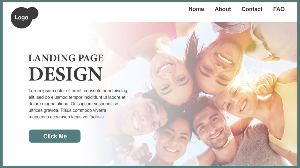
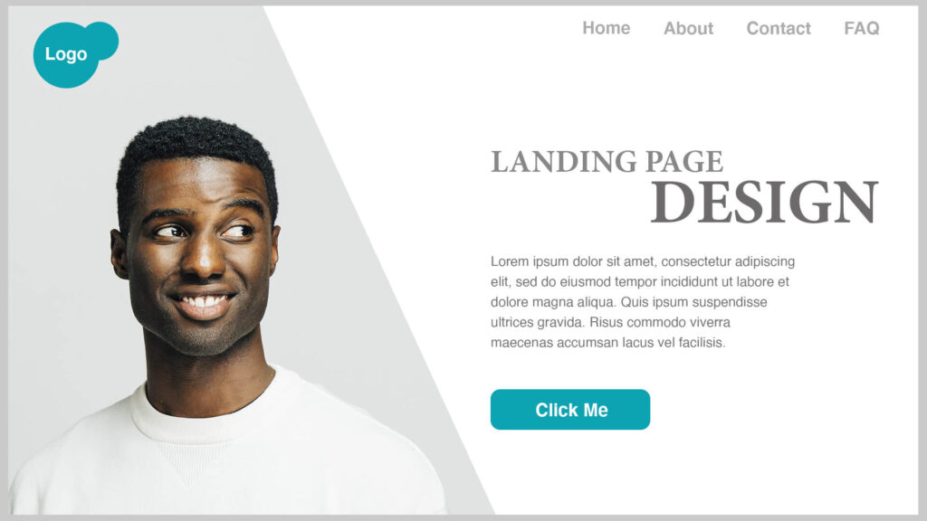
Typically the hero image is the first component a user experience. The hero image should be attention-grabbing but not at the sacrifice of clarity. A good test is to remove all copy and see if you can still understand what the page is about.
When it comes to the image, research would suggest that people-focus hero images are more effective than product shots or illustration. The use of real people tends to be more memorable and elicit emotion more effectively. Start with emotions and map them to the aspirations of your audience.
When it comes to designing for action, designers have a few tools that create a direct path to what we want the user to do. The first is to use colors in a way that calls attention to elements. For example, to highlight buttons use a mix of contrasting colors. In the example below, we’ve chosen a color that contrasts with the overall theme of the landing page to quickly draw attention to it.
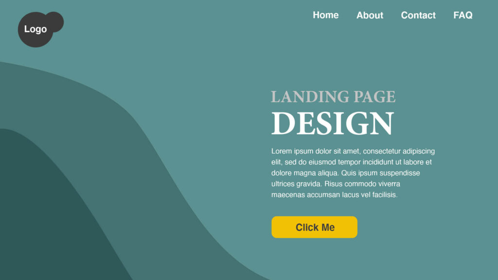
Negative space can also create an environment that forces focus on one specific element. Negative space is a useful tool for benefit-driven copy and buttons. Almost immediately a visitor to the page is pulled to the copy on the left.
Finally, use images to drive the users’ attention. Research using eye-tracking technology routinely shows the impact of the human gaze. We tend to follow eye lines and direct our attention in reference to where someone is looking. The strategic use of a person’s gaze can place the focus on a button or line of copy.
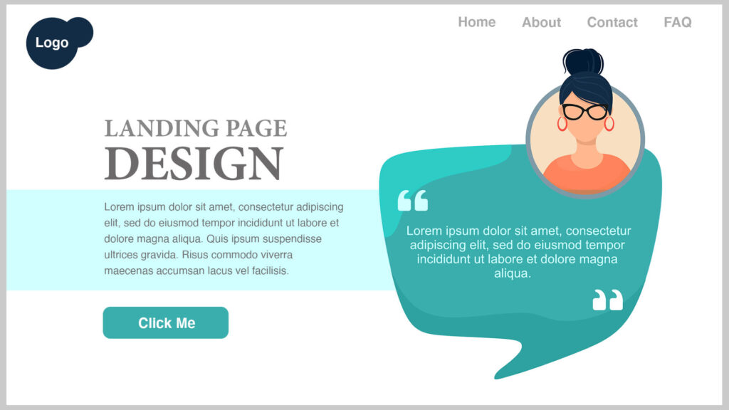
Social proof is one of the most vastly studied heuristics – or cognitive biases. Humans have a powerful desire to fit in and the quickest way to learn a behavior is to observe the crowd. Testimonials on landing pages is a common but effective practice.
When planning on placement of testimonials remember that they are important for reinforcing a user’s beliefs about a product or service. To help, include personal details that make the message more relatable and credible. Reflex words and emotions that are natural and mirror your audience’s.
A few additional housekeeping items to ensure you’ve built a solid foundation for your users. Make sure the page is mobile friendly. This means cut down on extraneous copy and make sure what’s above-the-fold is a positive user experience. Second, make sure your page load times are short. A few things you can do to keep your load times down are to optimize your images and video for the web, cache your web pages and minimize your pages code. Use Google’s Test My Site tool to find out how your page scores.
Read: 12 Tips, Tools, and Techniques to Optimize Images for a Lightning-Fast Website
Finally, don’t reinvent the wheel. If you’ve found success previously, pull in past learning or design elements. A new campaign doesn’t necessarily mean you need a newly designed landing page.
digital marketing, digital media, digital strategy for higher ed, enrollment marketing, higher education
client story, creative design, higher education, higher education website design, web development